Bus Route
The Bus App Project
The Project
More and more people have started making their way into less populated metropolitan cities. While many people who moved do not have a car, they must rely on public transit. Due to the amount increasing amount of people, public starts to become crowed and unsettling. During this project, I have taken the role of UX research, UX and UI designer as well as the facilitator during user testing. The client presented a problem about the city expansion and how the citizens of the city were upset about the newly added bus routes. The issue with these added bus routes is that the buses overlap at current bus stops and bus riders get confused because they may have gotten on the wrong bus or rushing to a bus that is not theirs.
The Solution
Thus the solution was to create an app that would help bus riders to identify the bus they are looking for and when their bus is arriving.
But before arriving at my solution came research which was the driving force of how my app came to be.
The Research
The initial research was to look through existing applications to figure out how others have solved this transit issue. Some key take aways from the this was that the images have lots of various button options, colors and information which could often be very confusing, especially for new users. After reviewing the apps came to conduct a survey and interviews to gather more information about how other people plan their trips and what features they use while on other apps.
58% of participants first search for their destination
58% of participants use Google maps to plan their routes
41% of participants most used feature is the pin/favorite
37% of participants use apps that track the Transit vehicle
Persona
The results from the interviews and surveys led to the conception of the persona of Maddison and her journey. Maddison is that she is a recent college graduate, who moved to a new city because her job. Some of her goals include trying to quickly move up the ranks at their new job in insurance claims and build a larger clientele. But in order to do so, she has to be on time and work hard. At this new city, Maddison does not have a car and lives out of the main city because she cant afford living closer to her work.
The Flow of Sketches
From the data and information that was gathered helped to identify the struggles that users came across while using other apps and riding the bus. These became the user stories used that drove the design of the app.
The top 3 MVPs below states that users want to know that….
when their bus is arriving at Washington and state bus stop, so I can calculate how much time they have to reach the bus stop.
The next bus arriving at the Washington and state bus stop, so that they don’t rush to the bus stop if it is not my bus.
The future arrival times of for any of the 7 bus lines (Washington and state), so that they know when my bus arrives.
Low Priority user stories included that user wanted to know
Where their bus is, so I know how far it is away from my stop
What directions inbound and outbound go, so they do not get on the wrong bus and go the wrong way
Initial Wireframing
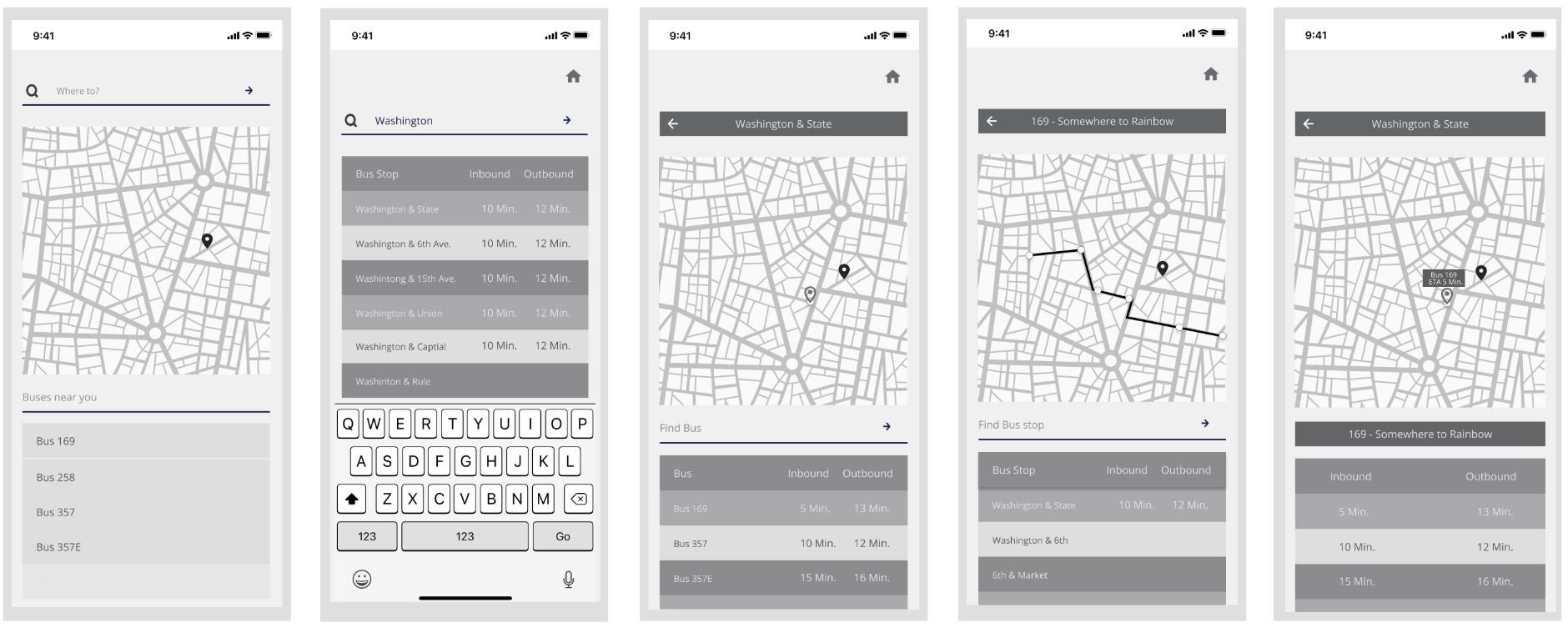
These are a few sketches of how the app and pages would look while navigating the app.
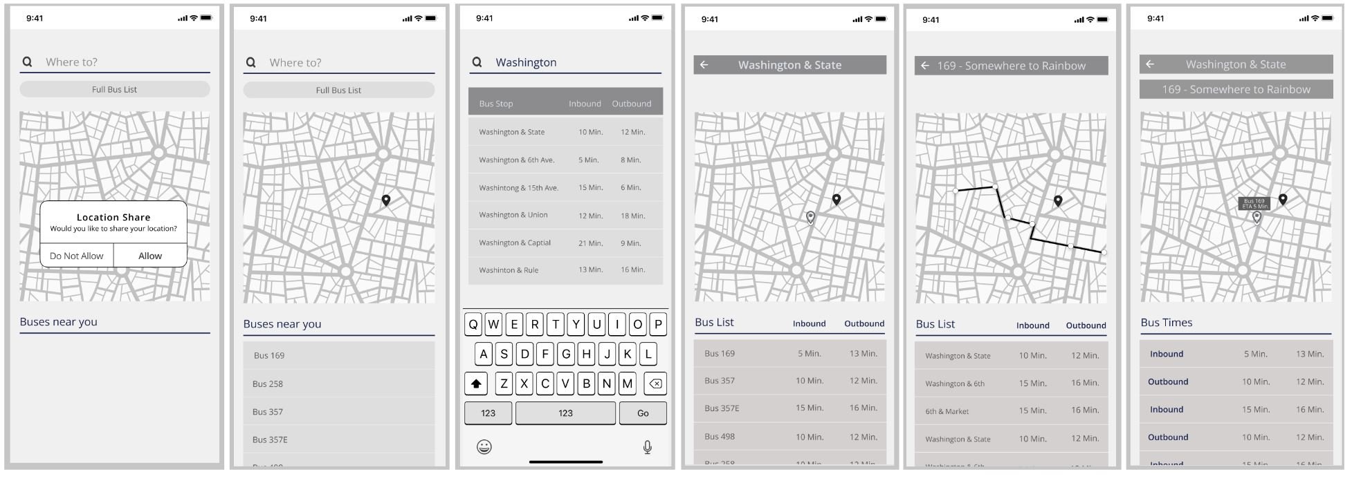
The images below are initial digital wireframes that derived from the sketches. A few initial wireframe testing was done to collect information about initial thoughts. The comments that the testers had were as follows:
Consistency
No need for 2 search bars
Icons too small
Lack of depth
Wireframe 1 (before)
Wireframe 2 (after)
Visual Design
The concept and feeling of the app is to convey SIMPLICITY, look CLEAN, and be FRIENDLY so that users have an easier time navigating the app with less confusion and unnecessary information.
The images on the left are a mood board of what they app may want to include in terms of color, typography, icons and logos.
Prototype 1
Next Steps
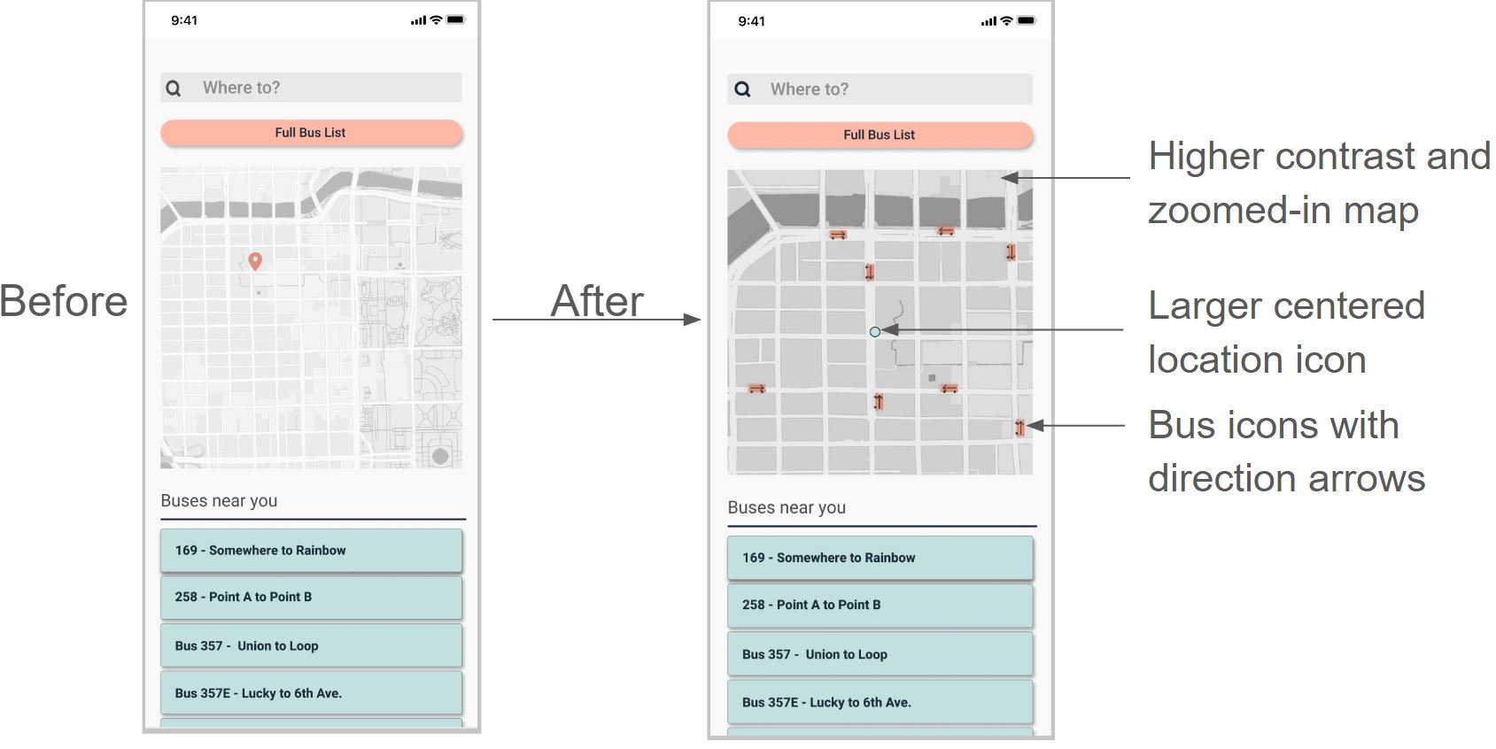
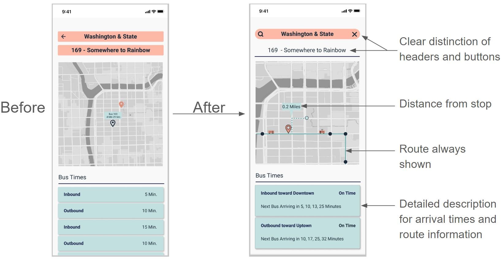
As the design of the bus app continued, it was time to turn colorless wireframes into colored prototypes. During the prototyping process, many users pointed out the following issues and statements.
- Current Location icon is not centered, small and blends with background
- Map not enough contrast and too zoomed out
-Buses near you don’t show buses
-Inbound vs Outbound Confusion
-No distance shown in relation to current location and bus stop
-No way to get back to main page or search bar


