The Fast Pass Experience
An Amusement Park Project
Welcome!
Within this past year, theme parks and amusement parks around the country, if not the world, have reopened. More and more people visit these attractions because they have missed the experience, the wonders but most importantly, the fun. As people return to the parks, the growing crowd each day results in longer lines and wait times for rides, events, food, etc. However, most modern theme parks have mobile apps allow people to check for wait times, order food, find attractions and much more. Some of these parks also, offer a way to bypass lines and wait times through a digital lightning lane, fast pass, or ride reservation.
The Challenge
The apps for theme parks are great to have and significantly helpful for those new to a the park, but most of these apps are confusing and unintuitive especially when navigating the fast or lightning pass experiences. Having people spend time trying to learn how the app works is unacceptable because people want to be able to enjoy themselves while at the park.
In this project I took on the role of UX researcher, UX and UI Designer while also communicating with end users for wireframe and prototype testing. The process was a collective effort between users and myself to deliver a enjoyable user experience.
The Research
In order to understand the users frustrations and pain points when navigating theme park apps, I first had to conduct interviews to gather information about what was not working and confusing when using these apps. It was vital to watch and learn what the users did when using the theme park apps because it allowed me to produce questions for a survey to see if others had similar frustrations and confusion.
Survey results concluded in the following statistics and importance for what needed to be improved in the theme park apps.
80% of participants strongly agree that wait times and filters were an important feature needed to fully enjoy the theme park experience
66% of participants found that reserving rides/attractions were difficult to navigate and a waste of precious park time
74% of participants agreed that the efficiency of features were more important that the quantity of features
Competitive Analysis
The research continued on with reviewing and analyzing existing theme park apps such as Disneyland’s, Universal Studio’s and Six Flags’ app. The purpose was to identify the strengths, weakness, opportunities and threats of all these various apps to help me better understand the results of the survey as well as provide a baseline for how to design the app.
The strengths that these apps provide is a clear sense of branding and the main focus of the app is to be a digital map. There are many weaknesses
Persona
In order to create this persona, the information gathered from the results of the survey was that the majority theme park visitors age demographic ranged from 19-29. However, the second majority of visitors are under the age of 18 and those who have children.
Charleen is a great target demographic to design towards. Charleens a workaholic that has finally got some time off for a short vacation. On this vacation she wants to get the most out of her trip and experiences, especially if she is travelling with friends.
Daniel on the other hand is a family man who wants spend as much time with his 2 kids to make memories and providing the best life for them. He is typically busy with work but when he goes on vacation he goes all out and makes certain to try minimize the amount of complaints from his kids (mainly complaining about wait time and walking too much).
Gertrude is the teen and the generation of technology where kids are always on their phones. Their only worry is to how to get to every ride and be able to ride the ride multiple times with their friends or family. Living her childhood memories all over because theme parks were always the best parts of her summer and she will always be apart of her life.
User Flow and Sketches
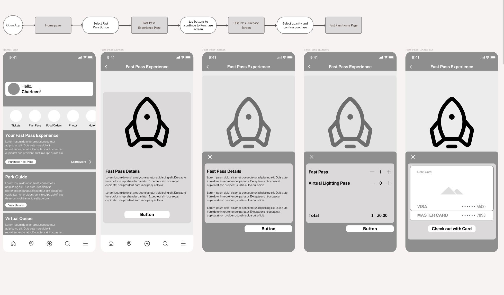
The initial sketching was an interesting process because there needed to familiarity in the app and the user flow had to be intuitive. The sketches were different panels at which a user may come to see when navigating the app.
The main user stories or MVPs for this project are as follows.
As a user I want to be able to…
- quickly view menu options so that I can better navigate to plan or purchase a fast pass
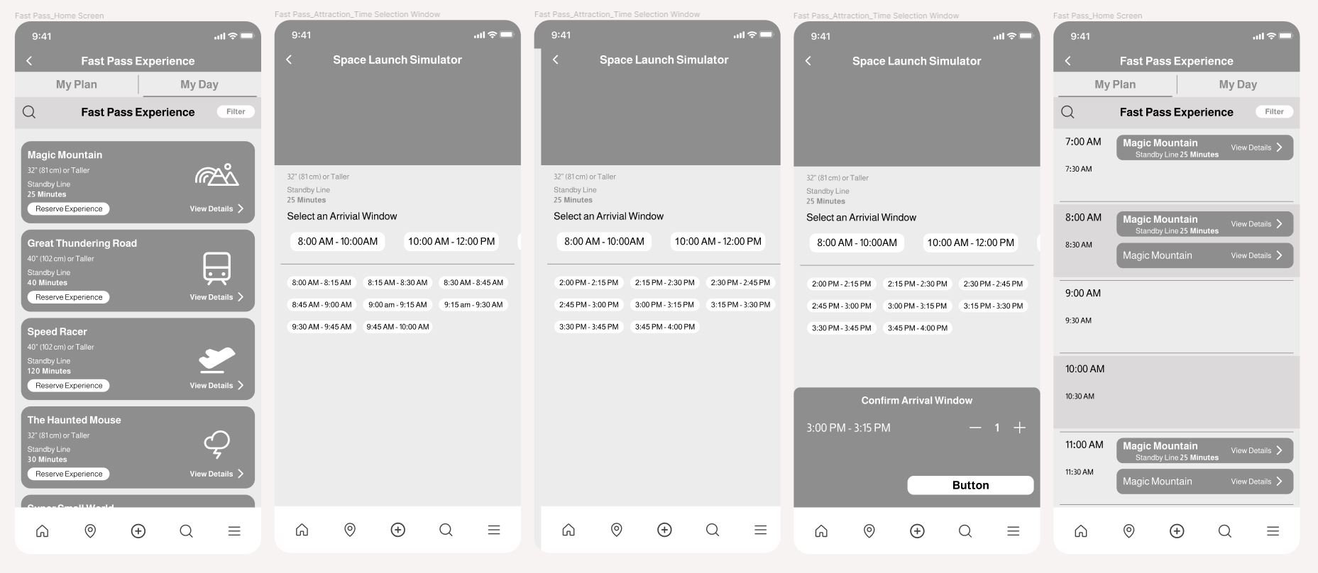
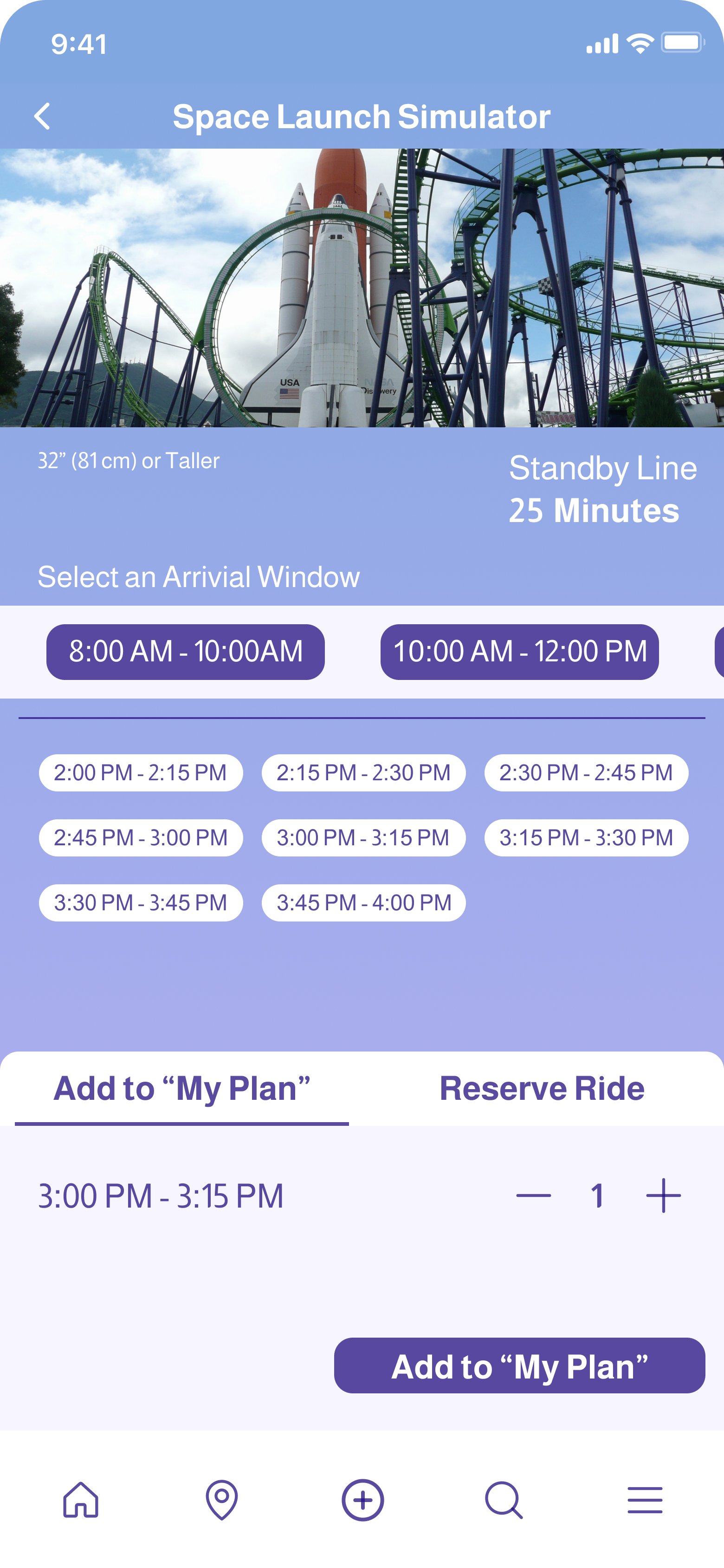
- Reserve to rides/attractions so that I can enjoy the full experience of the theme park
- view which rides/attractions I have already used the fast pass on so that I do not try to ride it again
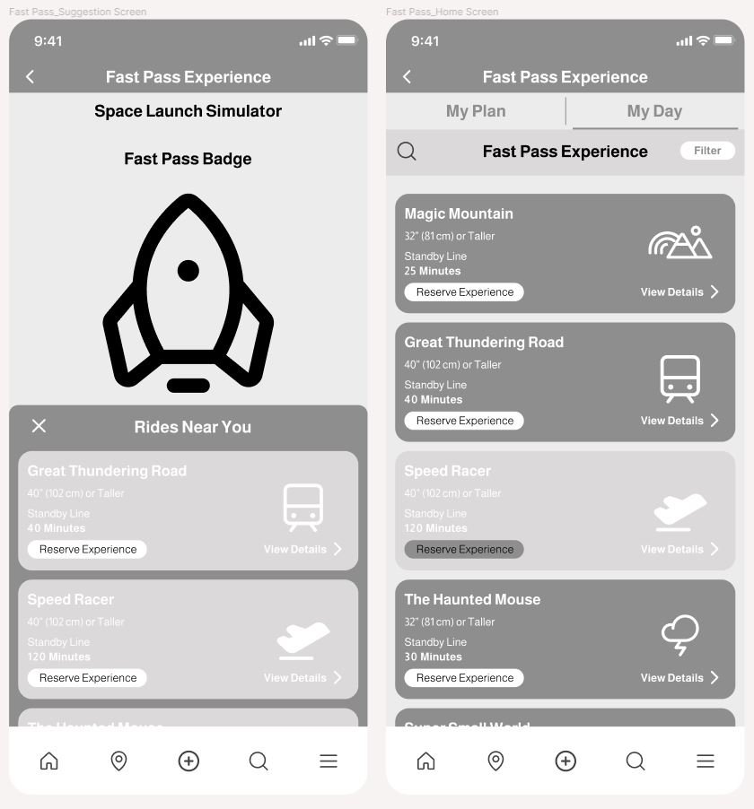
- view suggestions for rides with the lowest wait times or close by so that I can visit more rides/attractions
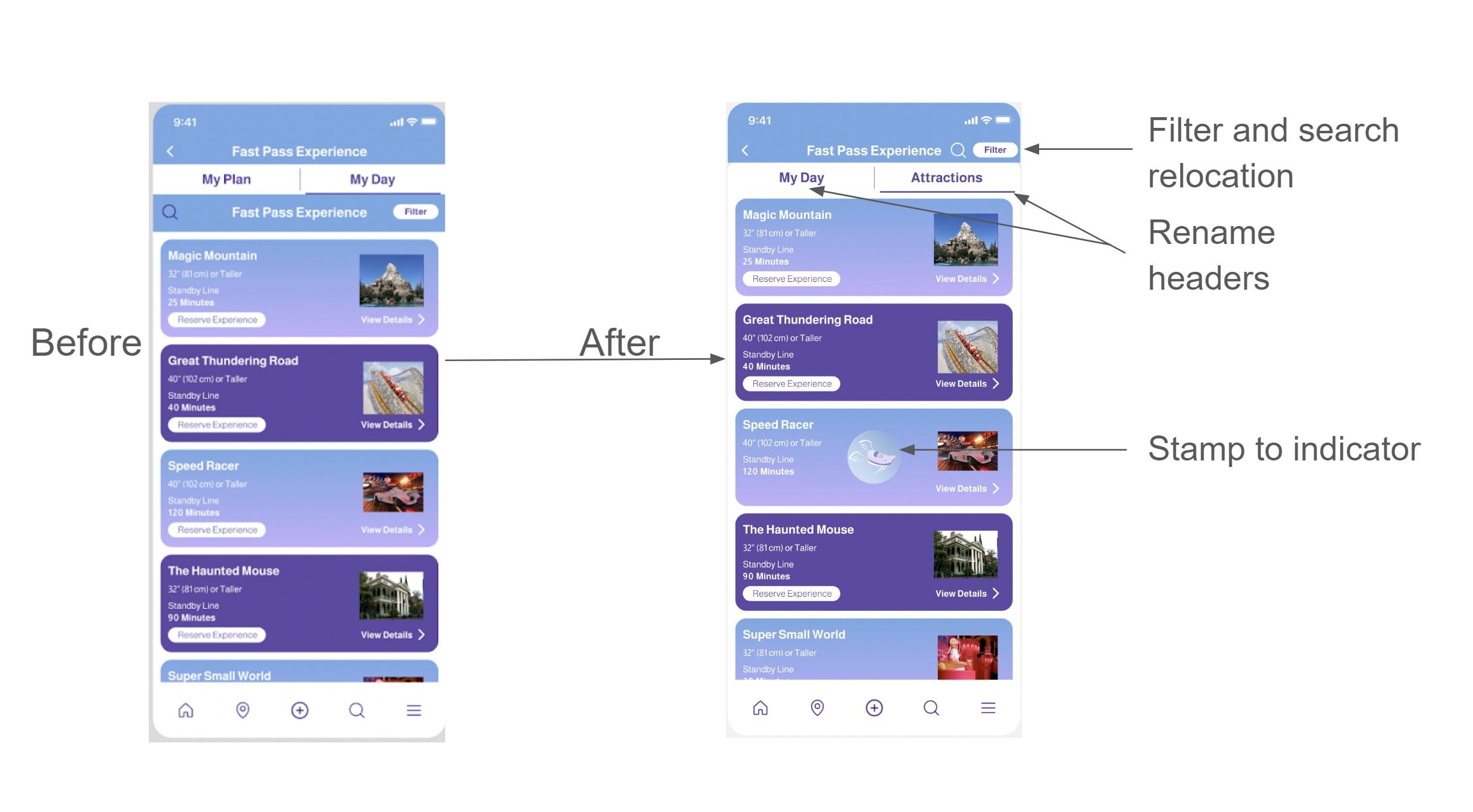
- filter through different various attractions so I can find what is appropriate to me
Wireframe Process
Initial Feedback
Wireframe testing was done to collect initial thoughts about how the app flowed, its usability and whether or not it solved the problems noted from the survey and interviews. The comments that the testers had were as follows:
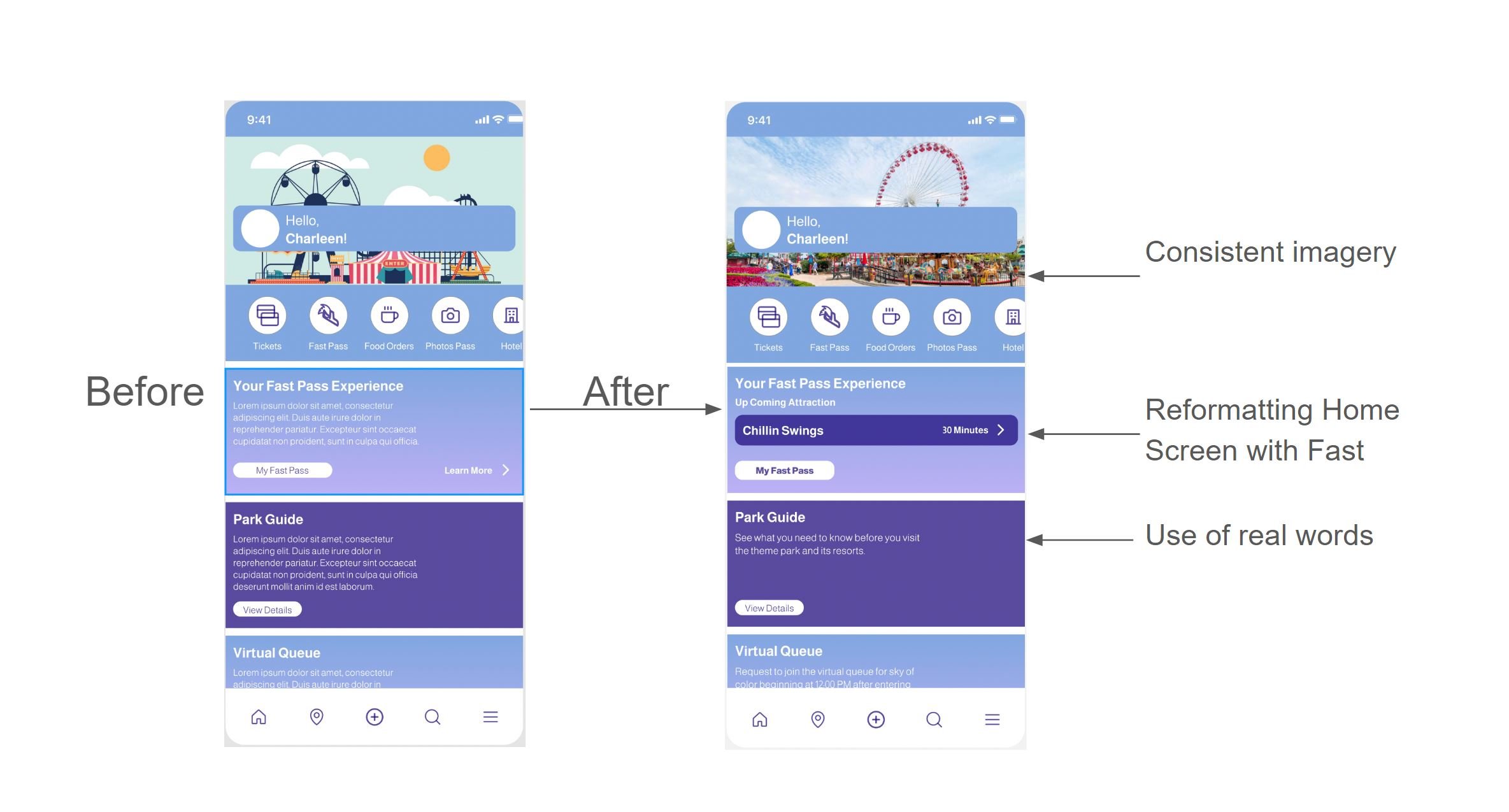
- Need Images in place of Icons and generic symbols
- Need real words to work and buttons that lead back to home page
- Function slide bars
- Need clear tasks, instruction and context that the app is not fully built
Visual Design
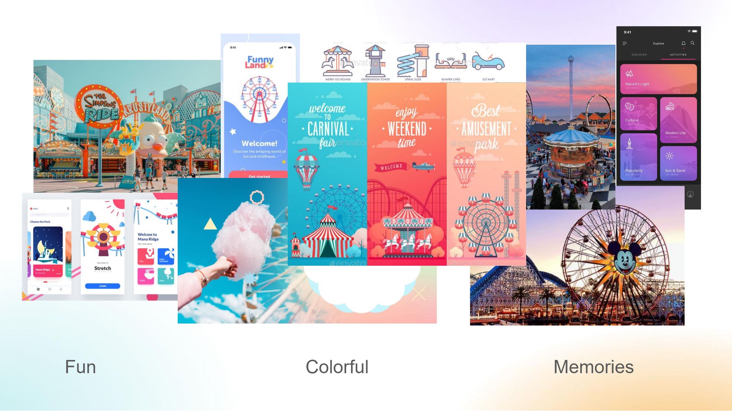
Before addressing the initial feedback and comments and wireframe testing results. I needed to develop the look and feel of the app.
The concept of the app is to convey feeling of nostalgia. The app wants to be FUN, look COLOFUL and be MEMORABLE so that users feel engaged without being distracted from all the content. In addition the content needed to have enough contrast so that users could easily view and navigate while being outside enjoying the park experience.
UI Kit
To keep on theme with the design concept, the thought process was to take similarities from existing apps and integrate them into the app. The colors chosen were to give a impactful contrast while the gradient provokes the thought of cotton candy or summer sunsets at a theme park. The logo design was inspired by remembering having to run around the theme park from ride to ride, as well as a fitting design for a “fast pass.”
High Fidelity Prototype
Prototyping and Testing
As the design of the bus app continued, it was time to turn colorless wireframes into colored prototypes. During the prototyping process, many users pointed out the following issues and statements.
- Titling for “My Plan” and “My Day” are confusing
- Inconsistent imagery on home page vs. Attraction page
-Fast Pass section should display upcoming booked rides or events
-Badge unnecessary, need confirmation of ride reserved in place of badge
-Hard to distinguish Used Fast pass on rides
Addressing Comments
Next Steps
Most the the users were receptive of the app design and had enjoyed fairly simple and friendly experience when going through the testing phase of this project. The users had also enjoyed the User interface of the app. However, there were still comments from the users that needed to be addressed, but at a different stage that required more interaction with the theme park it self. Notable next steps include the following:
- Develop confirmation notification after reserving ride
- Adding drop down menu to swap between attractions, food venues, etc.
- Refining button location and sizes
-Incorporating Location relativity when booking or viewing rides.
Lessons Learned
There were many challenges when designing this app but the key takeaways were that giving specific guidelines, instructions and scenarios were vital at each stage of the prototype screens because it difficult for participants to imagine they were at the theme park without being at a theme park. In addition, participants had wanted everything to function, which clarification and specifics must be given prior to user testing to avoid confusion.


